Tuesday, 3 February 2015

Locating- Week 6


This week I had my digital designs printed onto the fabric cotton canvas because I thought this was the most appropriate fabric to use for interior outcomes such as cushions. I was very pleased with the way they turned out as the colours came out really bright against the grey tones. I have also booked time in the print room for next week to develop my prints by hand. I want to add a couple of other processes to my prints such as flock and foil to give them subtle hints of texture. I think that when designing for items such as cushions that sometimes texture can be quite important, hopefully after my hand printing in the print room I will be pleased with the outcome. I have already had my motifs developed onto a screen that I will use on my fabric so I can plan ahead exactly what I will be printing whilst in the print room. Hopefully this will ensure that my printing is effective and efficient.
Here are some images of my digitally printed fabric


Friday, 30 January 2015

Locating- Week 5 - Networking

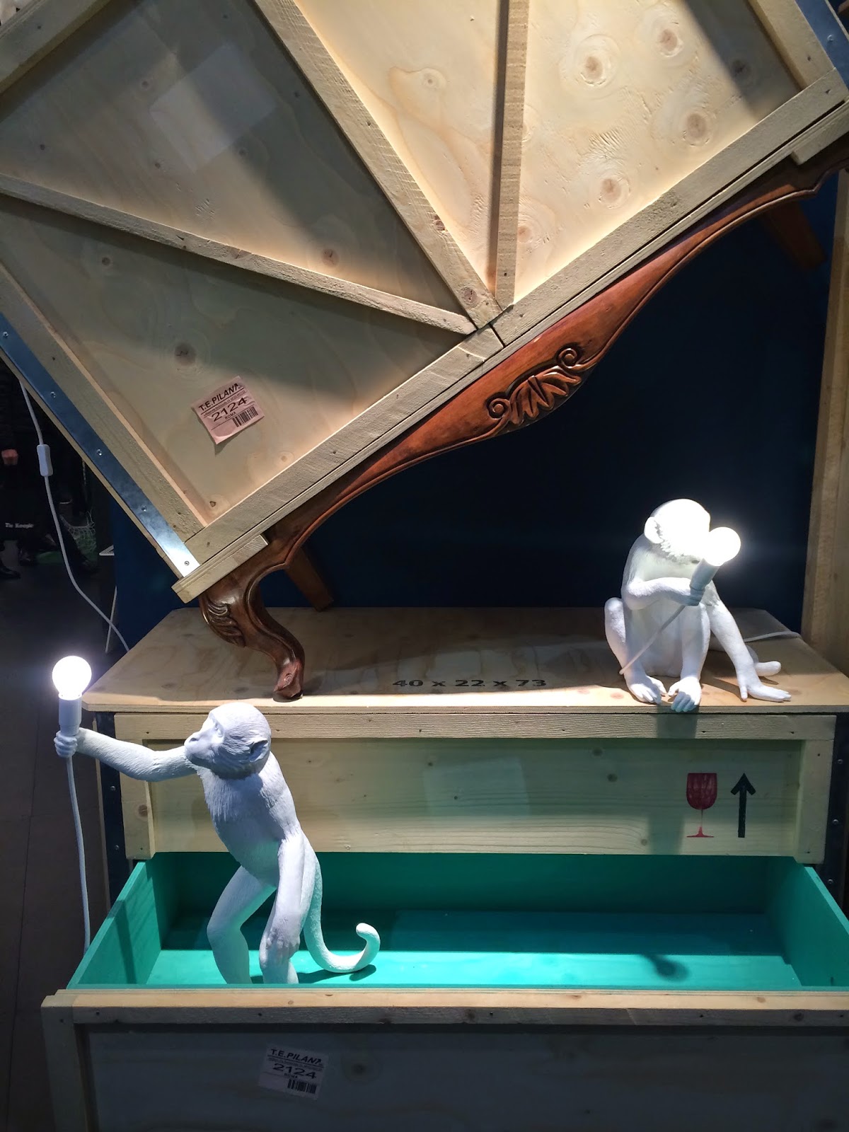
Last week I had the amazing opportunity of going to the Maison Et Object interior trade fair in Paris. I was able to view some of the biggest and best interior design companies from all around the world, all exhibiting their work in one space. Not only was it amazing to see how diverse the world of textiles is and how many different companies there are, but it was so interesting to be able to look at all of their newest trends and innovative designs before the general public. The whole experience of spending a few days in Paris and seeing everything I did at the trade fair was very inspirational and motivation for me. It made me think more about applying my own work to something more than just Uni projects, it made me think about life and the textiles trade after university. It inspired me to push myself further and be a bit more confident about my work, as usually I'm my biggest critic and often put my own work down as a result of this. But after seeing so much diverse work at the trade fair I am starting to see that in the massive world of textiles that there is a place for my own work and me. Also after speaking and networking with other textile artist displaying their work i learned what it was like from their point of view and how much of a privilege it is to show their work in such a large event within the textile world. After being a visitor to the trade fair it inspired me to think about one day being able to exhibit my own work at a trade fair and how much of an accomplishment that would be. Here are some images that I found inspiring from the trade show, 


I also signed up for the website Patternbank.com so i can see all of the upcoming trend reports and learn more about the inside textile community.


Saturday, 24 January 2015

Artist Inspiration - Pam Lostracco

The 'Mountain Mural' Bedroom Makeover

After doing some general research of mountains and landscapes i came across an image on Pinterest which i was immediately drawn to. After reading up about the image i found out that it was much more interesting than i initially thought. The image i found was called 'Mountain Mural' and was an article posted on the website apartmenttherapy.com which is a site i regularly use for inspiration and research. 
The article is written about one artists bedroom which she transformed by scaling up a painting she had already created. The artist is a Canadian woman called Pam Lostracco who is an artist and designer. After researching her work i have found many of her designs and paintings inspiring and can see some links between the work i have been creating and her own. I think the main influence for me would be that she works with themes found in Canada like the animals and the landscapes i have been looking at. But i was very interested to find out that the image i found so inspiring initially, was actually based on mountains in Thailand and sold as a calendar on her Etsy store.


'While traveling on many buses in Thailand and Laos, I saw endless ranges of beautiful and sometimes unusual mountainscapes. As we drove along side them, I drew the top edge of each ridge, stacking one on top of the other. The result became a new vista which is how I created this mountain design.'


I was so inspired by the initial painting that when i saw what she had created as a mural on her bedroom wall i was amazed at the talent and skill it must have taken to scale a painting up so precisely onto a wall, not to mention the creativity to think of such an original idea. 


Before


During the Process


'I composed a scaled drawing of my bedroom wall in Illustrator. Then, added a square-foot grid over the drawing which was transferred onto the wall using string. Square by square, I penciled in the drawing. The solid white (top) and charcoal (bottom) were painted first. Then I carefully blended the remaining middle colors to get a gradual gradation from light to dark.'


The Finished Mural


'This mural is 120 square feet and took 3 full days to draw the outline and paint. I used 3 different colors of paint: the white and natural white were leftovers from previous projects so only $50 was spent on a gallon of Kendell Charcoal from Benjamin Moore. The colors were selected to blend with the neutral tones in my bedspread, curtains and furniture.'

From finding one image i liked on Pinterest and looking a little bit deeper into it i have came across a medium that i would have never ever thought about. I find the idea of scaling up a drawing to create a mural a really interesting way of transforming a whole room in whatever way that you want. This imagery certainly has influenced some of the initial drawings that i created for this project but i think it mainly influenced me within my design development. As i was playing around with the idea of layering my drawings and designs up to create a slight depth within my prints, i felt that this was a good example of that. I find Pam Lostracco's work so captivating and inspiring that i could look at it all day and i would happily have one of her murals on my bedroom wall.

All images and information sourced from apartmenttherapy.com


Tuesday, 20 January 2015

Locating- Week 4

 I started creating some digital designs on Photoshop this week using my initial drawings that I had scanned into the computer. When designing my prints I didn’t want to mirror my images or create patterns. I envisioned my prints being more like a placement print with no repeating patterns. When I was designing I could see them being used as a feature print on a wall or soft furnishings such as cushions.
Although I felt like I had a good body of initial drawings I found it a bit difficult whilst designing to create a series of prints that didn’t all look very similar. I feel that because of the nature of my initial drawings, I had strong monochrome motifs that worked well when editing on Photoshop. I decided that I would keep my colour pallet very neutral only using black, white and different shades of grey. Alongside these neutral colours I would have very contrasting, bright, statement colours.


Tuesday, 13 January 2015

Locating- Week 3

This week I scanned in some of my more developed drawings that I have created and started to clean these images up on Photoshop ready to use to create some digital design ideas. Although I think that I prefer to look at the landscapes and not the animals I didn’t want to scrap this idea all together. I started experimenting with Brusho to create backgrounds and colourful patterns that I thought worked really well. 


After trying a few things I scanned in my Brusho paintings and printed them out onto paper. I then cut animal silhouettes out of them. I thought this technique looked really effective. I think that my next move is going to be figuring out how to incorporate my 2 ideas and bring them together to start creating some exciting digital prints. 


Wednesday, 17 December 2014

Locating- Week 2

This week I continued doing research on my Pinterest board and finding more visual imagery to inspire me to create my own work. I decided to create some drawings that were more landscape based, as apposed to looking at the animal side of the wilderness. I think that these worked really well. I mainly used sticks and ink to create these drawings instead of brushes to create a more rugged and unique look, I preferred using this technique because I think it gave my drawings a more rural kind of feel. In this image below i really like the contrast between the black and white drawings and the colourful painting. I think that i may use this technique within more of my work.


I found after looking at the landscapes such as trees and mountain ranges, more visually interesting and inspirational to draw from as apposed to the animals. So I carried on running with this idea and created some more of these landscape type drawings using different techniques and media.